Brand Corporate Identity Lectures & Tasks

Brand Corporate Identity Lectures & Tasks

Week 1- Week 14
Siam Siew Yong 0358399
Bachelor of Design in Creative Media | Taylor’s Design School | Taylor’s University

CONTENT

INSTRUCTION


LECTURES

Our lecture's are pre-recorded and
we require to watch 1 video every week

Week 1 :Introduction

Brand Cooperate Identity is an integral part of graphic design discipline as it focuses on the visual integrity of a brand.


Week 2: Brand

What is brand?(History)
The word branding comes from the Old Norse word brandr, meaning “to burn.” It originally referred to burning marks on livestock to show ownership (over 4,000 years ago in the Indus Valley). Over time, branding evolved: Past- Farmers marked livestock, artisans signed their work, factories labeled their products. And in Present- Companies use branding to differentiate their products and claim superiority.
Source: Taylor Holland

fig 1.1: Eg: Cattle brand

What is brand(general)
A brand is a person’s gut feeling about a product, service, or company. Companies can’t control this feeling, but they can influence it through communication and differentiation. A brand exists when many people share the same perception. It’s not what the company says it is—it’s what the public says it is. A brand is a mental construct shared by society.
Source: Brand Gap

What is brand identity?
Brand identity is the collection of elements a company creates to shape how it’s perceived. It includes both the gut feeling (emotional aspect) and the visual identity (logos, colors, design, etc.). It helps manage and influence the public’s perception. It is not the same as brand image (how it’s perceived) or branding (the process).
Source: DeBara, 2017
    What is Branding?
    Branding is the process of giving a meaning to specific organization, company, products or services by actively creating and shaping a brand in consumers(Marion,2015)Branding can be archived thru brand definition, brand positioning statement, brand identity, advertising and communications, product design…

    Benefit of Branding
    - Branding helps you stand out in a saturated market
    - Branding gives you credibility
    - Branding gives you credibility.
    - With a clear brand, you can charge what you're worth.
    - Branding leads to customer loyalty.
    - Branding leads to returning customers & referrals.
    - Branding = Consistency.
    - Branding helps to attract your ideal clients.
    - Branding your business will save you money and time.
    - Branding will give you confidence in your business.
    - Established branding makes it easier to introduce new products/services.
    - Branding gives you a clear strategy for moving forward

    Designer role
    Designers are essential in shaping a brand’s visual identity, translating content, strategy, and messaging into a cohesive and memorable image. They conduct research, understand the target market, and create design systems that ensure consistency and impact across all brand touchpoints. Their work helps build trust, recognition, and loyalty.

    fig 1.2: cycle of branding

    Branding reverses this cycle by creating a positive chain reaction:
    Differentiation → Collaboration → Innovation → Validation → Cultivation
    Cultivation involves constant improvement and challenging the norm.
    This cycle helps build a sustainable competitive advantage

    Week 3: Types of Mark

    Logo
    - Commonly used term for any graphic mark representing a brand.
    - Origin: Short for logotype (from Greek “logos” = word).
    - Correct Term: Trademark is the broader, more accurate term.

    Types of Logos:
    - Logotype: Text-based logo using company name or initials.
    - Logomark: Symbol/image-based logo.
    - Misunderstanding: People often think a logo must include both text and image.
    - Usage: “Logo” has become a catch-all term for various brand marks (symbols, emblems, monograms, etc.).

    Signature
    - A combination of a word (logotype) and a symbol (logomark).
    - Also known as a combination mark.
    - Logotype = Wordmark: A logo made entirely of text (company name or initials).
    - These terms are often confused, but each has a specific role in brand identity.

    Monogram:
    - Monogram: A symbol formed by overlapping or combining two or more letters (usually initials).
    - Commonly used as recognizable logos for individuals or companies.
    - Origin: From Greek, meaning “single line”, referring to an outlined or unified form (Mollerup, 2001).
    - Monograms serve as stylized, minimal brand marks.

    Heraldry:
    - The art and study of designing and displaying armorial bearings (armor-related symbols).
    - Includes study of ceremony, rank, and lineage (pedigree).
    - Origin: Predominantly European in style and structure.
    - Though symbols and flags exist globally, heraldic style is Eurocentric.

    Related terms:
    - Crest: Top element of a heraldic display.
    - Coat of Arms: Full heraldic design representing a person, family, or entity.
    - Insignia: Symbol or emblem denoting rank or membership.
    fig 1.3: Liverpool Football Club's crest
    fig 1.4: Malaysian government's coat of arms

    fig 1.5: Royal Malaysian Police insignia

    Crest
    - A distinctive device representing a family or organization.
    - Positioned above the shield in a coat of arms (originally on a helmet).
    - Can also appear separately (e.g., on stationery or official documents).

    Trademark
    -A legally registered symbol, word, or phrase representing a company or product
    - Primary Function: Identification of origin or ownership.
    - Often used within a design programme to maintain visual consistency.
    - Part of broader branding efforts:
    - Design programme = Organizational-level identity control.
    - Branding = Product-level identity control.
    - Quoted from Mollerup (2001): Trademarks aid identification through structured visual system. 

    fig 1.6: example of trademark

    Trademark also provides legal protection against intellectual property theft or infringement.
    • Service Mark(SM): A trademark specifically for services (used in the U.S. and other countries).
    • Unregistered Marks: TM (Trademark) and SM (Service Mark) indicate pending or informal use.Not legally protected until registered.
    • Registered Trademark (®): Typographic symbol indicating official registration with a national trademark office. Provides full legal rights and protection to the owner.

    Week 4: Brand Ideals


    A brand ideal is the higher purpose of a brand—something that goes beyond the products or services it offers. It reflects the inspirational reason a brand exists and connects deeply with consumers.
    • A strong brand needs shared intention from its leadership to effectively engage its audience.

    • Brand ideals are driven by values, which serve as a "true north" to guide the brand's direction.

    • Good brand values reflect consumer beliefs while staying true to the brand's passion and purpose.

    "A brand ideal is a higher purpose that goes beyond the products or services they sell."


    Examples of Brand Ideals

    Vision – Courage to imagine and act on bold ideas.

    Meaning – Develops over time and must be communicated clearly.

    Authenticity – Knowing and staying true to the brand’s identity builds trust.

    Differentiation – Stand out meaningfully, not just for the sake of being different.

    Sustainability – Ensure long-term relevance in a changing world.

    Coherence – Consistency builds familiarity, trust, and loyalty.

    Flexibility – Be ready to adapt and grow with time.

    Commitment – Everyone involved should be fully dedicated to the brand’s success.

    Value – A brand must deliver results and maintain its worth as an intangible asset. 


    Week 5: Positioning

    Brand positioning is the process of placing a brand in the mind of the consumer. It defines how a brand is perceived compared to competitors.

    While terms like positioning strategy, brand strategy, or brand positioning statement are used interchangeably, it's important to note:
    • Strategy is the long-term plan (the map).
    • Positioning is the current location and destination on that map (Willis, 2017).
    Why Positioning Matters
    • A strong brand position is hard to change.Example: Volvo was seen as "safe" but lost appeal to men due to low excitement.
    • Many brands today lack distinction and feel similar.
    • To stand out, find the gaps in competitors’ positioning (white space in the market).
    4 Ways to Win in the Market
    1. Challenge the Leader – Compete head-on with major brands (e.g., Pepsi vs. Coke). Requires time and resources.
    2. Target a Niche – Focus on an underserved segment within a broader market.
    3. Reframe the Market – Change how consumers view the category by making existing benefits feel outdated.
    4. Be a Disruptor – Create a new category (e.g., Uber, Xerox). Be first, but move fast to stay ahead of imitators (e.g., Grab copied Uber).
    Building a Positioning Strategy

    Start by asking:

    • Who are you?

    • What do you do?

    • Why does it matter?

    Steps to clarify positioning:

    1. Assess current brand positioning.

    2. Identify direct competitors.

    3. Analyze competitor positioning.

    4. Find what makes your brand unique.

    5. Create a clear, value-driven idea.

    6. Write a brand positioning statement.

    7. Test its effectiveness.

    4 Elements of a Brand Positioning Statement

    Target Consumer – Who are you targeting (demographics + mindset)?
    Market Definition – What category do you belong to?
    Brand Promise – What’s your key benefit?
    Reason to Believe – Why should consumers trust that promise?

    Template:

    “For [target market], [brand] is the [market definition] that delivers [brand promise] because [reason to believe].”


    TASK 1-BREAKING BRAND

    We required to breaking an existing brand, do research and analysis on the brand we choose.


    In week 3, I done my presentation and there are some correction and improvement need to do.
    Feedback from Dr Vitiyaa: adjust the flow of slide, make it clear; add transformation of logo

    DRAFT PRESENTATION(week 3)

    FINAL PRESENTATION SLIDE

    TASK 2A-Logo Research & Analysis

    For this task, I explored logos from brands that I've frequently encountered over the past few months. These selections are based on my personal environment, daily interactions, and media exposure. Below are the brands I chose and the contexts in which I’ve seen them.
    TASK 2A by siam siewyong


    TASK 2B-Logo Design

    Requirement- Alongside your brand or occupation selection, produce at least two sheets of idea sketches weekly—more is encouraged. Begin by creating mind maps to identify key keywords and visual elements related to your brand. Use these insights to develop rough idea sketches, which will evolve into more refined concepts.

    Our submission need to include
    1) Logo in BW, reverse & colour
    2) Logo space rationalization & clearspace
    3) Logo with strapline
    4) Logo with rationale (brand ideals)
    5) Logo minimum size
    6) Brand primary & secondary colours
    7) Logo/brand typeface(s)
    8) Patterns derived from logo
    9) Logo animation (GIF)

    My initial concept idea was Cat interacting with fish, like a cute cat playing with or hugging a fish-shaped plush doll
    • symbolizing comfort, playfulness, and companionship 
    • ideal for a toy brand targeting children and parents

    And here's my initial sketches

    fig 2.1: initial sketches


    As Ms Vitiyaa pointed out that the brand I designed is a toy brand (similar to Jellycat), she suggested that I create a more distinctive and memorable logo. As a result, I decided to revise my original logo design and chose a cat and a dog as the brand's mascot characters. She also recommended that the brand name should be more catchy, so I reconsidered and refined the naming of the brand as well.

    fig 2.2: mind map(revised)

    So my new brand name called 'Mallow Friends
    'Mallow' sounds like marshmallow-- convey cuteness and sweetness and 'Friends' represent the closeness, so my idea for the revised logo will be a cat hugging a dog

    fig 2.3: some sketches of the logo

    In the class,
    Feedback from Ms Vitiyaa on this logo: The design is too detailed—when scaled down to a smaller size, it becomes difficult to see clearly. Try to make it simple.
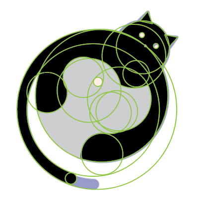
    Based on the feedback, I came up with a new idea, which I have decided to use as my final concept. It is abstract and simple.
    fig 2.4: final concept idea
    fig 2.5: final concept idea
     with color palette

    I started using Adobe Illustrator to digitize the logo, to make it more refined and professional version of my logo.

    fig 2.6: logo with the guideline

    After this, I began my Final Logo Development, which must include all version of logo, logo usage guideline, logo rationale, brand primary & secondary colours, logo/brand typeface(s), patterns derived from the logo and logo gif.

    fig 2.7:gif progress in photoshop


    Task 2B final-all version of logo pdf


    Task 2B final-logo design pdf


    Task 2B final-logo gif

    TASK 3-Positioning & Identity

    Requirement- Create a logo rationale that clearly explains the design choices, referencing key brand profile keywords and core values to demonstrate alignment with the brand’s identity. Develop a mood board that includes colour palette, visual style, and typography to establish a distinctive and consistent visual direction. Apply the logo across essential stationery such as business cards, letterhead, continuation sheet, and invoice, ensuring coherence with the mood board. Design at least four branded collaterals—such as a t-shirt, tote bag, lapel pins, or product packaging—to extend the identity across physical touchpoints. Establish the brand’s digital presence through website and social media designs, and apply the visual identity in environmental graphics and mockups, including signage, shop front, and reception desk, to fully express the brand in both physical and digital spaces.

    Our submission need to include
    1) Logo Rationale
    2) Mood Board Creation
    3) Design Brand Applications: Business card, Envelope, Letterhead & continuation sheet, Invoice
    4) Additional Brand Collaterals: Design at least 4 other brand items, e.g.: T-shirt, Tote bag, Lapel pins, Product packaging...
    5) Digital Presence & Environmental Graphics: digital platforms like website, social media ; environmental graphics: signage, shop front, reception desk

    I prepared my mock up by using Adobe Illustrator and Photoshop.
    Illustrator was used to design the brand pattern, Photoshop was then used to create realistic mockups.

    fig 3.1: envelope design process

    fig 3.2 business card design process

    fig 3.3: letterhead & invoice design process

    fig 3.4: label tag design process

    fig 3.5: sticker&tote bag design process(some)

    After creating a few pattern designs in Illustrator, I brought them into Photoshop and applied them to mockup photos. I played around with the placement and scale to see which pattern worked best and whether it fit naturally with the product. 

    fig 3.6: box mockup process

    fig 3.7: letterhead mockup process

    fig 3.8: envelope mockup process

    fig 3.9: reception desk mockup process

    fig 3.10: vanishing point tool in ps

    After designing several patterns in Illustrator, I imported them into Photoshop to test how they would look on real products. I used tools like Vanishing Point to match the perspective of the pattern with the mockup surface, and adjusted the layer blending modes, opacity, and transform controls (like scale and warp) to make the pattern look more natural and realistic.

    After I finished all the collaterals, I compiled it together for submission. 

     
    Task 3 Positioning & Identity pdf

    Submission drivelink:
    https://drive.google.com/drive/folders/1lIXzDPGGLgloLFRYEx91sCuweFOJwNPF?usp=drive_link


    TASK 4-Brand Guideline Creation

    Requirement- We need to prepare a neatly collated printed A4 booklet and present our brand in class.

    Our submission need to include
    1) The Brand
    •     Core values, mission, vision (from earlier tasks)
    2) Visual Guide (based on Task 2)
    •     Logo usage (versions, clearspace, sizing)
    •     Colour palette
    •     Typography
    3) Applications (based on Task 3)
    •     Examples of stationery, collateral, digital presence, and environmental graphics

    In this task, I used Adobe Indesign to create the layout of my booklet

    fig 4.1: booklet design in Indesign

    fig 4.2: with guideline, margins and columns

    My guideline, margins and columns will be stable in all pages.

    fig 4.3: book design elements

    In week 12, I completed my booklet design and printed out for physical submission.
    Below are the final submission of booklet in pdf and presentation slide in pdf.

    Task 4 booklet pdf

    Task 4 presentation pdf

    Submission drivelink:
    https://drive.google.com/drive/folders/1hmgfKaASDHv-LizZ63kDN52S6JusG1mZ?usp=drive_link


    FEEDBACK

    Week 1
    Introduce of MI and weekly plan

    Week 2
    Briefing of task 2 and what need to do in week 3

    Week 3
    Adjust the flow of presentation of slide, make it clear, add transformation of brand logo

    Week 4
    Start to do mindmap for logo, complete 2A 

    Week 5
    Absent

    Week 6
    Think a again ur brand name, as u are doing toy brand, need to be relatable

    Week 7
    Kindly make ur logo more simple

    Week 8
    ILW

    Week 9
    Need more collaterals, more than 4 better

    Week 10
    Keep move on to ur moodboard

    Week 11
    Maintain clear space around the logo to ensure it's always legible and visually distinct

    Week 12
    Change ur invoice total due position, create the signage and shop front with desk mock up

    Week 13
    No feedback


    REFLECTION

    Experience

    This module has been quite a journey, and each task taught me something different. In Task 1, we kicked things off by learning about MI and getting a clear breakdown of what each week would look like. That structure really helped me stay on track. During Week 2 and 3, I started preparing for Task 2, organizing my slides and reworking the flow to make them more clear and engaging. I also began exploring ideas for my logo and brand direction.

    For Task 2, I dove deeper into the branding process. I started with a simple idea of a cat playing with a fish plush toy, which I thought was cute and playful—perfect for a toy brand. But after getting feedback from Ms. Vitiyaa, I realized I needed something more unique and memorable. That led to the idea of a cat hugging a dog, and the name “Mallow Friends,” which felt much more fitting and emotionally warm. I refined the logo in Illustrator, making it simpler and cleaner, and started building a full brand identity around it.

    In Task 3, I focused on applying my brand pattern to mockups. I created several pattern designs in Illustrator, then tested how they looked on real products using Photoshop. I used tools like Vanishing Point, blending modes, and warp to make the designs feel more natural on curved or angled surfaces. It was fun seeing my work come to life like that.

    Finally, for Task 4, I used InDesign to put together a printed A4 booklet that presents my brand. I made sure to keep the layout consistent by setting up margins and columns properly across all pages. By Week 12, I had the booklet printed and ready to present, which felt like a great way to wrap everything up.

    Observation

    One thing I noticed throughout this whole process is how even small design decisions can make a big difference. In the early stages, changing the order of my slides or adjusting how I framed the content really improved the clarity of my presentation. When it came to logo design, I learned that simplicity is key—especially when a logo needs to work at different sizes.

    I also saw how important it is to test things visually. Just because a pattern looks good on screen doesn’t mean it’ll work well on a product. Applying the patterns in mockups really helped me figure out what felt right. And while making the booklet, I realized how much impact clean layout and spacing can have. Consistency really helps everything feel more professional.

    On top of that, I found that other students’ work was creative, unique, and showed many different styles and directions. It was inspiring to see how everyone interpreted the brief in their own way, and it pushed me to explore more ideas and think beyond my initial comfort zone.

    Findings

    The biggest thing I’ve learned from this module is that design takes time. Every task reminded me that the first idea is just a starting point—it’s through refining and exploring that better ideas start to form. I also learned how important it is for visuals to carry meaning. A good logo isn’t just cute or nice-looking; it says something about the brand’s personality and purpose.

    Using Illustrator, Photoshop, and InDesign together made me appreciate how each tool plays its own role in the design process. Illustrator helped me create precise, clean graphics. Photoshop brought those designs into real-world settings. InDesign tied everything together into a polished final presentation. Most importantly, I’ve learned to trust the process and stay open to feedback—it always leads to better work in the end.

    Comments

    Popular posts from this blog

    VSP EXERCISE

    Video & Sound Production Siam Siew Yong 0358399 Bachelor of Design in Creative Media | Taylor’s Design School | Taylor’s University

    Digital & Social Media Communication: Final Compilation

    Digital & Social Media Communication: Final Compilation Week 1- Week 14 Siam Siew Yong 0358399 Bachelor of Design in Creative Media | Taylor’s Design School | Taylor’s University