Publishing Design Task 2:Content Generation
Siam Siew Yong 0358399
Bachelor of Design in Creative Media | Taylor’s Design School | Taylor’s University
Bachelor of Design in Creative Media | Taylor’s Design School | Taylor’s University
List of content
Instruction
Module information
Assignment Brief
Lectures
Lecture 3:Type Redux
Typography is the art of arranging and composing, and is also a medium of
expression and most importantly communication.
Good typography = better readability and better design.
Character in a typeface consists of
- Small caps
- Numerals
- Fractions
- Ligatures
- Punctuations
- Mathematical signs
- Symbols
- Non-aligning figures
In Adobe Illustrator/InDesign: Go to Type/Text → Glyphs
You can view all special characters in a font.
Ligatures are the merged characters formed to alleviate the
awkwardness of the gaps in-between the letters. Ligatures are to improves
elegance and readability.
InDesign can automatically apply ligatures.

Weights in typeface includes light, light italic, regular, regular
italic, semibold, semibold italic, bold, bold italic...
Good typeface or type family have large amounts of typefaces under them.
Legibility always used to choose fonts designed for reading.
- Type Size: For standard books and long-form reading, keep font sizes between 8 points and 12 points.
- Line Length (Measure): The ideal length for a column of text is 50 characters per line (including spaces). The absolute maximum should be 60 to 65 characters. Anything longer tires the reader's eyes and makes it easy to lose their place.
- Leading (Line Spacing): A good rule of thumb is to make your leading 2.5 to 3 points larger than your type size (e.g., a 9pt font pairs well with an 11.5pt or 12pt leading).
- Exception: Open typefaces with large x-heights (like Helvetica) or lines that exceed 65 characters require slightly wider leading to maintain a clean text rhythm.
- Underlines: Default software underlines often touch or slice through descenders, breaking character shapes and lowering reading speed. Manually lower the underline so it clears the text cleanly.
- All-Caps (Uppercase): Use only for short headlines or subheads. Setting entire sentences or paragraphs in all-caps destroys word shape recognition and makes reading slow and painful.
- Horizontal/Vertical Scaling: Never squeeze or stretch fonts using software percentages. It destroys the type designer's original proportions. If you need a narrower look, use a genuine "Condensed" cut from the font family.
- Outlines & Shadows: Limit headline strokes to a maximum of 0.5pt to 1pt. Keep drop shadows tight and close to the source text so they don't muddy the shapes. But most of the time, dont do that.
Composition Flaws: Widows, Orphans, and Rivers
- Orphans: A lone, single line from the end of a paragraph that gets pushed over to the top of a brand-new column or page.
- Widows: A single word or very short line left stranded all by itself at the very end of a paragraph.
- Fixing Widows & Orphans: Clean them up by selectively adjusting your kerning (letter-spacing across a line or paragraph).
- Justified Text & Rivers: Fully justifying text can create awkward white gaps that run vertically through your paragraphs like "rivers." If you justify your text, you must manually adjust the tracking and word-spacing settings to even out the color of the type.

Alignment
- Flush Left, Ragged Right
- Most readable for long body text
- Left side is aligned, right side appears uneven naturally
- Flush Right, Ragged Left
- Right side aligned, left side uneven
- Difficult for long reading because the starting point changes every line
- Centered
- Text aligned to the center
- Suitable for short text only (titles, invitations, quotes)
- Not recommended for body text
- Justified
- Both left and right sides aligned evenly
- Creates a clean block appearance
- Needs careful spacing to avoid “rivers” (large awkward gaps between words)
- Asymmetrical / Mixed Alignment
- Creative or experimental layout combining different alignments
- Usually used in expressive or modern design layouts
Task 2
In task 1, I have already completed my book writing, which supported by AI
tools.
We required to include two subtexts and one oullquote in each chapter.
And the total words much equal or more than 3000 words.
Here's my final contents of book with words only.
my 3k word in format
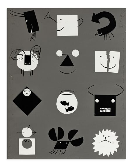
In this task, I highlighted the text I want to create visuals for. After that,
I started to find the visual reference and creates 3-5 visuals per week. By
Week 3, I was still a bit unsure about my visual direction. I had two styles
in mind: one using real images in a collage approach, and the other focusing
on minimalist illustrations and children's book illustration style.


fig 1.1 some visual references
Mr. Vinod also recommended that I explore more visual references, such as Alan Fletcher’s illustrations and books by Paul Rand. Their works inspired me to experiment with playful yet simple visual compositions.
|
|
fig 1.2 Alan Flectcher pentagram
|

|
|
fig 1.3 Paul Rand's book
|


.indd-01.jpg)
.indd-02.jpg)
Feedback
Week 3:
General feedback:-
Specific feedback: The illustrations is too literal, use indirect and abstract
visual for the book. Develop a consistent style, like patch and shape
style/minimal and conceptual/ paper cut style. Do more visual reference and
make sure the text come with clean grammar.
Week 4:
General feedback: Complete Task 1 portfolio in the class
Specific feedback: Don't apply ur visuals on the page size first, If I
design everything based on the layout first, it can become harder to adjust
the composition later.
Week 5:
General feedback: complete task 2
Specifc feedback: Task 2 visuals so far ok. Looks like children illustration
book.
Reflection
Experience:
At the start, I was quite unsure of the direction—I kept switching between doing a collage style with real images and a more minimal illustration-based approach. Because of that, my process felt a bit scattered and I didn’t really have a clear visual identity yet.
Eventually, I decided to fully commit to Adobe Illustrator and start building everything from scratch using simple shapes and lines. It was quite time-consuming, and at times a bit frustrating, but it really helped me slow down and pay attention to details like composition, spacing, and consistency. After finishing the visuals, I brought everything into InDesign to arrange them into thumbnail layouts. That stage actually helped a lot because I could finally step back and see how everything worked together as a whole book
Observation:
Looking back at my earlier visuals, I realised they were too literal. I was basically illustrating things exactly as they were, without much interpretation. Because of that, the visuals ended up feeling more like a children’s storybook rather than something more conceptual or design-driven.
I also noticed that maintaining consistency is harder than it looks. Even though I was using the same shapes and line style, some of the visuals still didn’t feel like they belonged in the same system. This made me understand that having a “style” alone isn’t enough—you really need to be intentional and disciplined with every single element you produce.
Findings:
One of the biggest things I learned from this task is that visual development is not just about making something look nice—it’s about building a clear and consistent system that supports the idea. Looking at references like Alan Fletcher and Paul Rand really helped me understand this. Their work made me realise how powerful simple, smart ideas can be when compared to overly literal visuals.
I also found that abstraction communicates better than direct illustration in many cases. Instead of showing everything clearly, leaving room for interpretation makes the work more engaging and thoughtful. This shifted the way I approach my visuals—I started moving away from literal drawings and towards simpler, more symbolic forms.
Comments
Post a Comment